
January 2016 Newsletter
**** The 4specs Perspective
Look over the questions in last month's newsletter. The question I focused on when thinking through a redesign of 4specs to make it mobile friendly was:
Who is the audience? Who, what, when, where, why and how?
Our primary focus on 4specs is supporting the full-time architectural specifier with a secondary focus on the design team and others in commercial and institutional construction. For the most part their use of 4specs and the manufacturer's websites will be done on a desk computer and iPads on a project site. I do not expect much effective use of smart phones.
My primary goal was to improve my Google search results and provide better results to those smart phone users coming to 4specs. Many years ago I converted 4specs from using tables for display formatting to CSS (Cascading Style Sheets) and have carefully checked all the pages for consistency.
By simply adding a mobile CSS file, when the display width was narrower than 768 pixels the following changes were made:
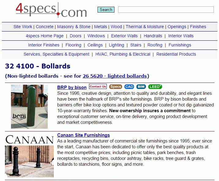
Here is a standard full-sized display of a section page:
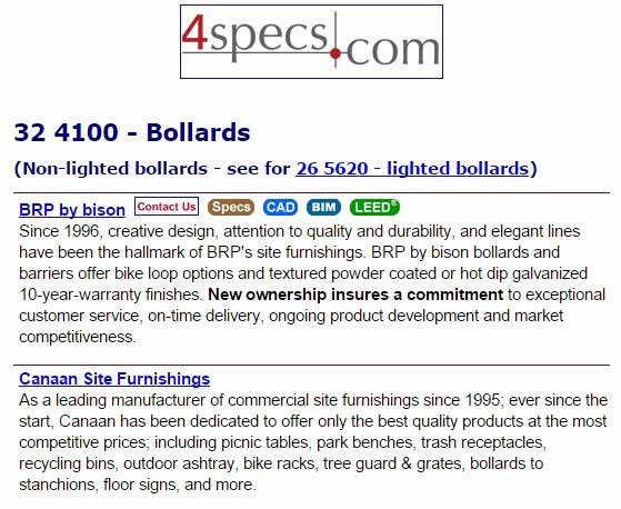
Here is the mobile version of the same page:
You can check your website by going to a narrow view (click on upper right icon to reduce the width) and see what your page looks like.
For 4specs, the code was simple to change:
Original css code for advertiser images as an example:
.float_img{padding-bottom:3px;padding-top:3px;}
Updated css code in mobile version (plus some other changes to activate this code):
.float_img{display:none;}
For our case, the changes were simple. For your website it will probably be more difficult.
I recommend starting to review your website at a narrow width and see what can be changed or deleted and still provide the information needed by the user.
Next month, I will show what happened with our results from Google with these changes.
Colin
--------------------------------------
Colin Gilboy
Publisher - 4specs
Contact us